Congress · Payments · Fintech
Forward. A congress website without reloads.
Stack selection, implementation and ongoing care for Forward, a cashless.pl congress on payments and finance. The design came to me finished, and I built the site on WordPress and Barba.js.
- My role
- Stack selection, implementation, maintenance and monitoring
- Sector
- Payments and finance congress
- Focus
- WordPress, Barba.js, agenda
A finished design, my choice of stack
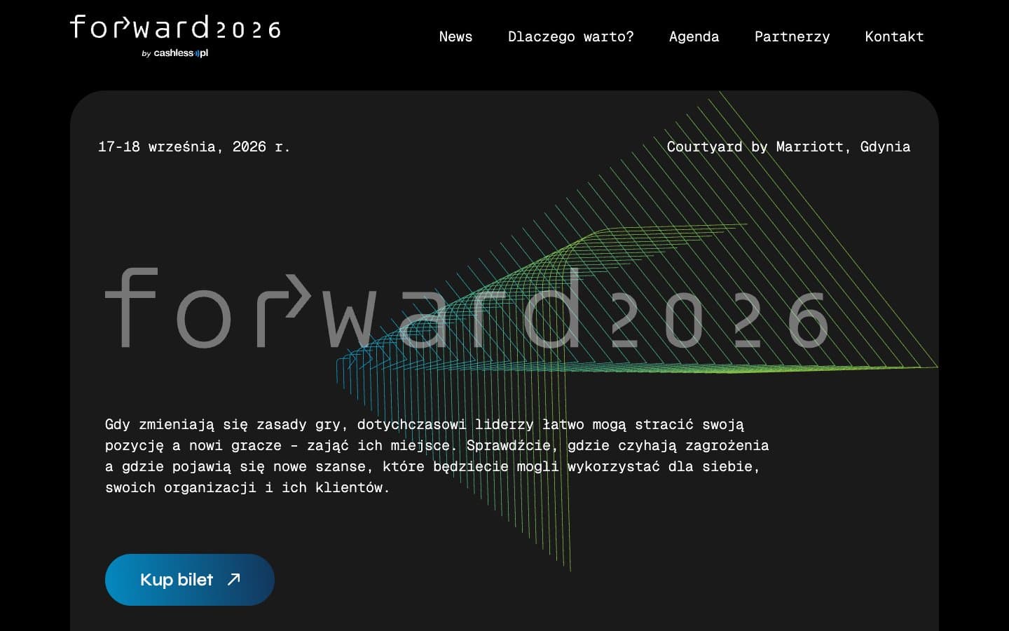
The design for Forward came to me finished. My work began with a technical decision: what to build the website on for a congress organised by cashless.pl, so the design could be reproduced faithfully and developed further.
I chose WordPress with a custom theme, plus Barba.js. A theme written for this design keeps the code close to the approved layout rather than adapting it to a ready-made template, while WordPress handles publishing.
A lot of content on one page
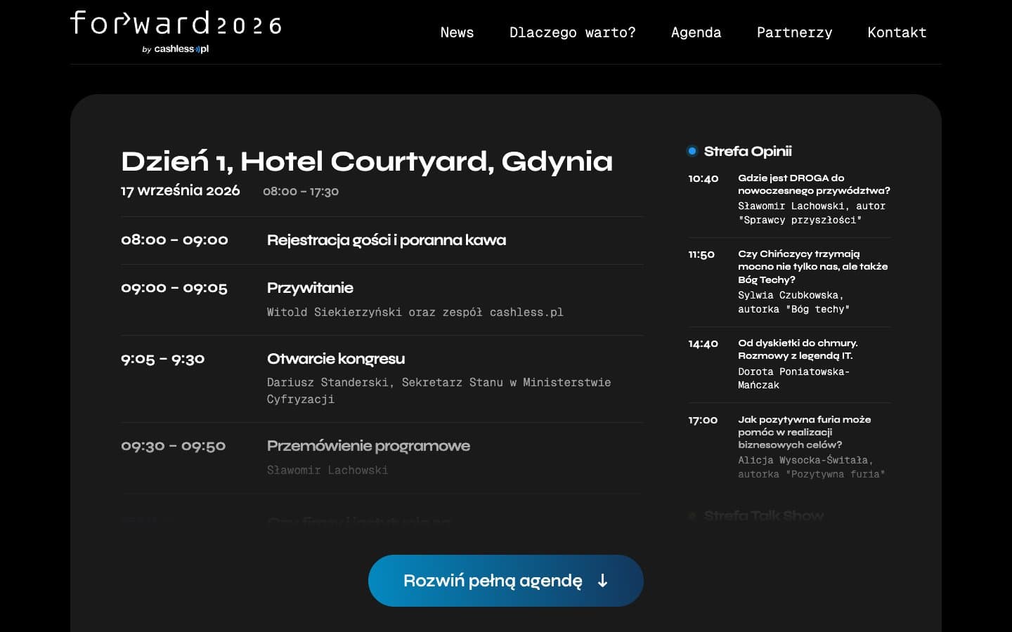
The homepage runs through News, Why attend, Agenda, Partners and Contact. The agenda covers two days, 17 and 18 September 2026 at the Courtyard by Marriott in Gdynia, with numbered sessions and the formats Speech, Chat and Ring, where two people face each other. It starts collapsed, and a button expands the full programme.
Partners are arranged in eight tiers, from the organiser and honorary patronage to the Forward Night partner and institutional partners. News holds around 80 articles with their own pages and a numbered archive. Ticket sales through ekobilet.pl open in a window on the page.
Transitions without a reload
Barba.js swaps the content when moving between pages, for example from the homepage to an article, without a full reload. The transition itself is a short 220 ms fade to a dark background, in keeping with the design’s black palette.
The effect is not mandatory. People with reduced motion enabled in their system see the page change with no animation. Links opening in a new tab and the WordPress admin skip Barba and behave as ordinary navigation.
Phones and ongoing care
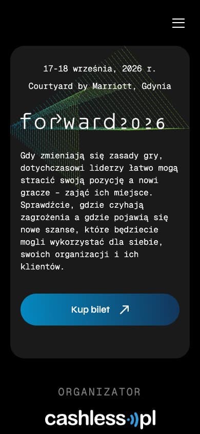
At a 390 px viewport the navigation moves behind a menu button that opens a full-height panel. The collapsed agenda matters most here: the full programme runs to several screens on a phone, so visitors expand it only when they need it.
My role did not end at launch. I still maintain the website and monitor how it runs.
Have a finished design and a lot of content to handle?
Show me the design and tell me what the website has to do. We can agree the stack, the build scope and the care after launch.