Communications · Strategy · Culture
The Making. A website with its own rhythm.
Full-stack development, animation and ongoing support for The Making, a strategic communications consultancy working across architecture, real estate and culture.
- My role
- Full-stack development and support
- Sector
- Strategic communications and PR
- Focus
- Animation, typography, narrative
Development for a business that works with meaning
The Making shapes narratives for places, property projects and institutions. The way its website presents information is part of that communication: visitors should get a sense of the consultancy before exploring the details of its services.
My scope covers frontend and backend development, complex animation work and technical support. A central implementation task was bringing expressive movement together with smooth behaviour and readable content.
Large type, focused pieces of information
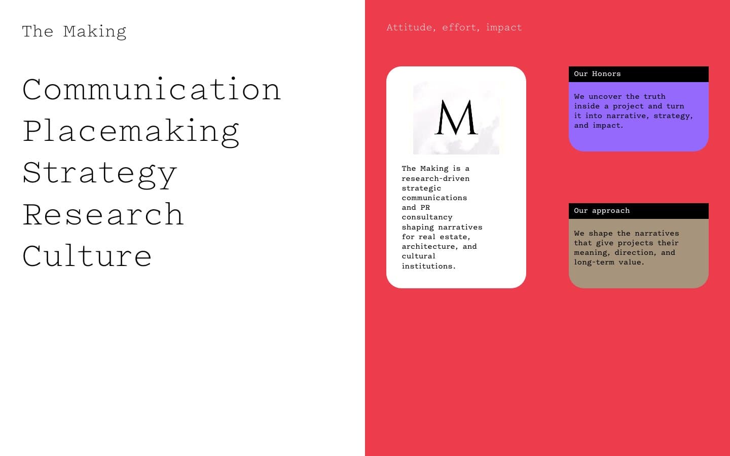
Communication, Placemaking, Strategy, Research and Culture lead the homepage. Shorter blocks beside them explain the business’s approach. The large lettering establishes character, while the smaller cards introduce specifics without turning the opening into a wall of text.
An interface like this depends on implementation details between its most striking moments. Spacing, reading order and scrolling behaviour all matter. Animation becomes a development problem with its own states and dependencies.
Several ways into the consultancy’s work
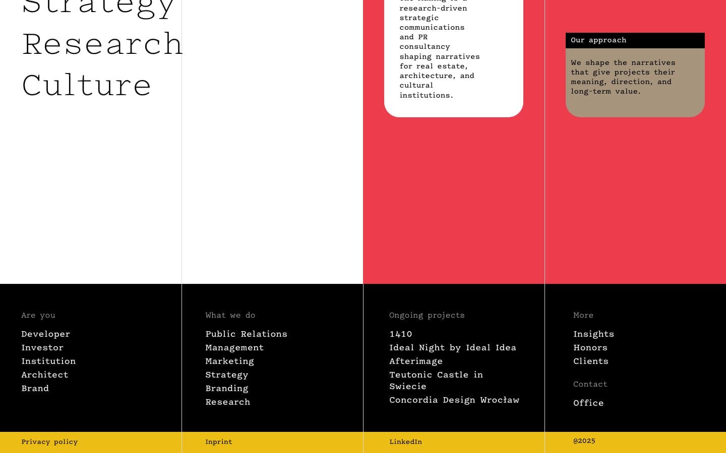
The lower part of the homepage groups information by audience, service, ongoing project and further reading. Developers, architects and institutions can begin with the area closest to their interests.
It combines a strong visual opening with a practical directory. After the first impression, visitors have a clear next step: explore the work, understand the services or get in touch.
Keeping the character on a smaller screen
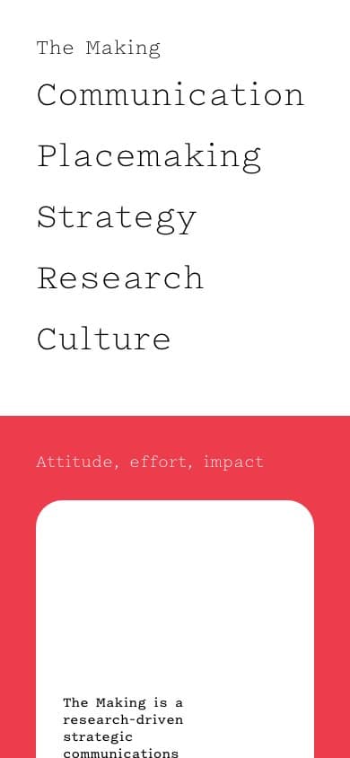
For a website built around oversized lettering and movement, the phone layout tests the composition in a different way. The hierarchy needs to survive, text needs room and interactive elements need to remain reachable.
The mobile capture shows the visual language within a narrow viewport. A still image records the layout; the live website is the best place to experience the animation.
Does movement matter to your project?
Show me the visual direction and explain how the website should behave. We can define the implementation and how to check the result.