Publishing · Media · Animation
Burda Media Polska. A website built out of movement.
Full-stack development and ongoing support for Burda Media Polska: an animated tile grid leading into the organisation’s areas.
- My role
- Full-stack development and support
- Sector
- Publishing and media
- Focus
- Animation and complex navigation
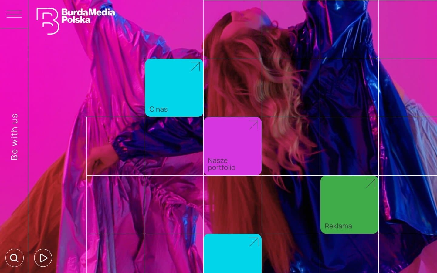
A publisher introduced by image rather than menu
Burda Media Polska is a large organisation with several areas: about the company, portfolio, advertising, recruitment and news. A conventional menu would turn that into a table of contents. Here the entry points are coloured tiles placed over full-screen fashion photography.
I handle the implementation and ongoing support. On a project like this, the development work is mostly about keeping a strong visual idea practical: the page has to respond smoothly and the tiles have to remain ordinary, accessible links.
Several ways in, rather than one path
A job candidate, an advertiser and a journalist are each after something different. The tiles serve those needs in parallel: everyone picks their own area instead of following one shared route.
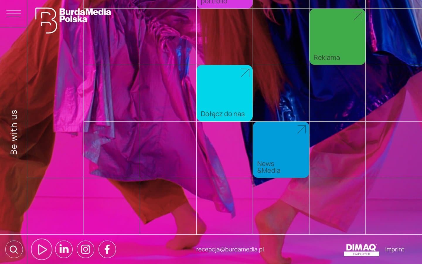
Scrolling reveals further tiles and a footer with contact details, social links and the DIMAQ mark. The side rail reading “Be with us”, along with the search and play buttons, stays on screen, so the content changes without losing your bearings.
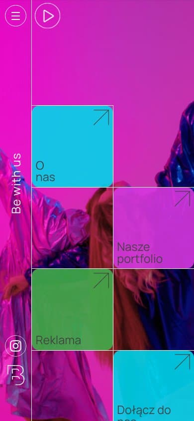
The same language on a phone
On a narrow screen the tiles form two columns and the photography remains the background rather than decoration. The vertical lettering and controls stay, so the character of the site survives the mobile layout.
This is the most demanding part of a project like this: holding a distinctive layout together in a smaller frame, without flattening it into a plain list of links.
Have a visual idea that has to work?
Show me the direction and tell me how the site should behave. We can agree the build scope and how to check the result.