Catalogue · Search · Content import
Brands in Audio. A catalogue that fills itself.
Interface design and frontend and backend development for the Brands in Audio directory, including RSS import and ongoing support.
- My role
- Interface design and full-stack development
- Type of site
- Directory with search and filters
- Focus
- RSS import and browsing a large set
A different job from a brochure website
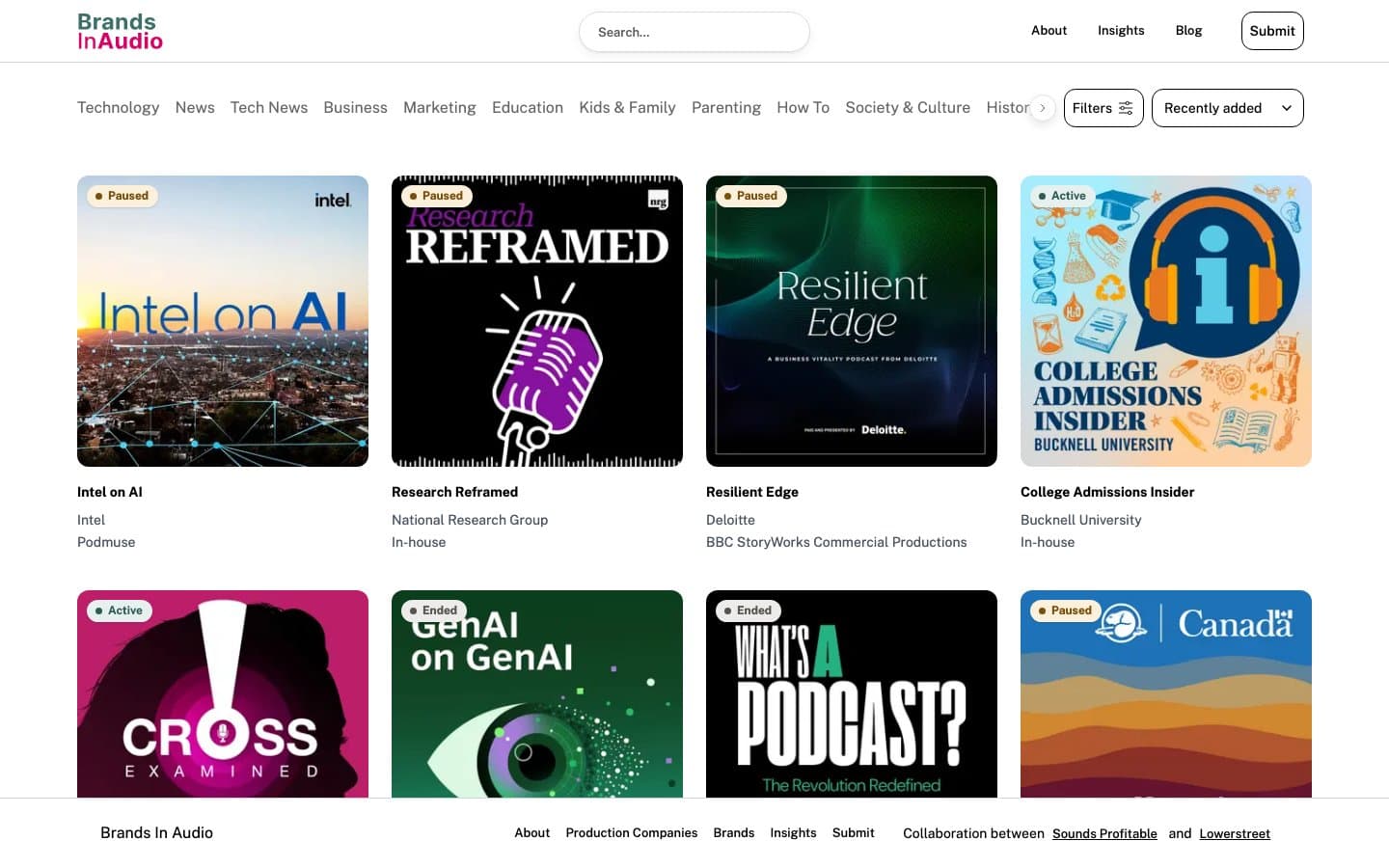
Brands in Audio is a directory of branded podcasts. A website like this is not judged by its homepage but by whether you can find anything in it. That is why search, a category bar, filters and sorting all sit at the top: four ways to narrow the set before anyone scrolls.
I designed the interface and built the whole thing. On a catalogue, design and code are hard to separate: the card layout depends on the data that actually arrives, not the data you would like to show.
A card that has to survive incomplete data
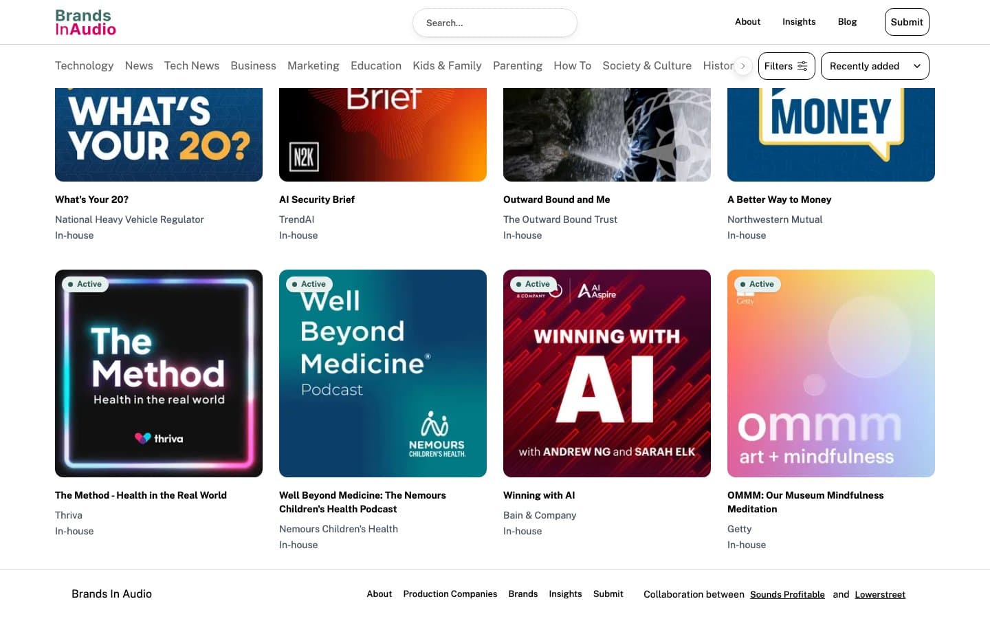
Every entry carries cover art, a title, the brand, the production company and a status: active, paused or ended. Status matters here, because the directory also documents shows that are no longer being released.
Content arrives automatically through an RSS import. That changes how you design: titles run long, artwork varies in quality and some fields come through empty. The layout has to look right with partial data, because nobody is tidying each entry by hand.
Filtering on a narrow screen
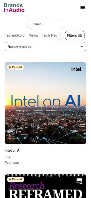
On a phone, the four navigation tools from the desktop layout cannot sit side by side. The category bar scrolls horizontally, the sort control takes the full width and cards stack into a single column.
This is the classic directory problem: the more ways there are to filter, the harder it is to build a mobile layout that does not overwhelm. The screenshot records the approach in the live site.
Have a project with features of its own?
Tell me what the site needs to show and where that data will come from. We can agree the scope and how it stays up to date.